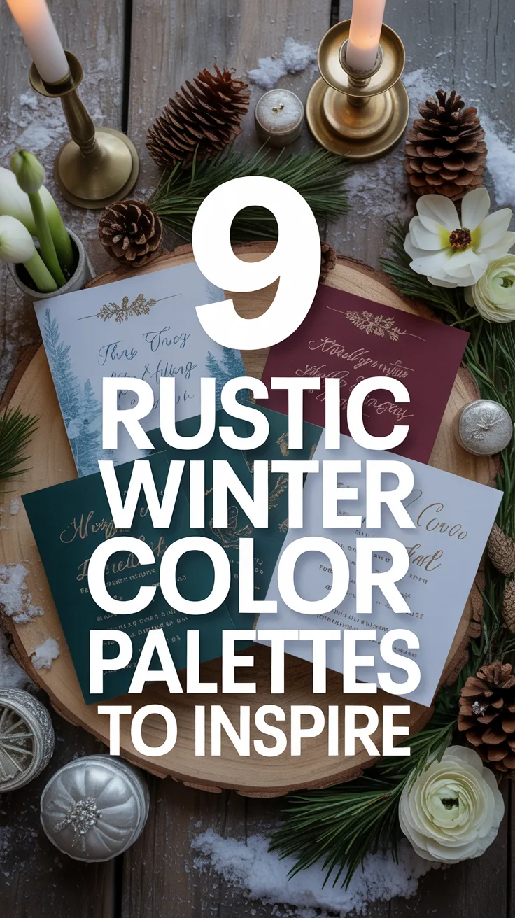
Introduction
Planning a winter wedding with rustic charm? You’re in for a treat! As someone who’s helped coordinate dozens of winter celebrations, I’ve seen firsthand how the right color palette can transform a venue from ordinary to magical. There’s something undeniably romantic about embracing the season’s natural beauty while creating a warm, inviting atmosphere for your guests. In this guide, I’ll walk you through nine stunning rustic winter wedding color palettes that will make your special day unforgettable. From cool, icy tones to rich, warm hues, these combinations will help you create the cozy winter wonderland of your dreams.
Why Choose a Rustic Theme for Your Winter Wedding

I remember attending my first rustic winter wedding in Vermont years ago, and I was instantly captivated. The raw wooden beams adorned with twinkling lights, the scent of pine, and the warm glow of candles created an atmosphere that felt both elegant and comfortably intimate.
A rustic theme works beautifully with winter for several reasons. First, it embraces natural elements that are already abundant during the season – think evergreens, pinecones, and wooden accents. Second, rustic decor naturally creates warmth in contrast to the cold outdoors. And finally, this theme offers incredible versatility, allowing you to be as formal or casual as you’d like.
When I planned my sister’s January wedding, we found that incorporating rustic elements helped us stay on budget too. Instead of expensive floral arrangements, we used branches, berries, and candles to create stunning centerpieces that perfectly complemented her winter wedding color palette.
Pro Tip: Don’t fight the season – embrace it! If you’re having a winter wedding, lean into seasonal elements rather than trying to recreate spring or summer. Your decor will feel more authentic and your budget will thank you.
Palette 1: Icy Blues and Silver
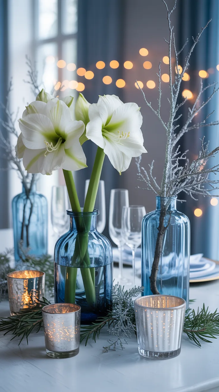
This palette captures the ethereal beauty of winter like no other. I’ve seen this combination transform venues into breathtaking winter wonderlands that leave guests in awe. The cool tones of pale blue, powder blue, and silver create a sophisticated atmosphere that feels both fresh and timeless.
- Primary colors: Powder blue, ice blue, silver, white
- Best for: Formal venues, evening ceremonies, December-February weddings
- Complementary textures: Crystal, glass, mercury glass, silk
Last year, I helped a couple incorporate this palette by using blue-tinted glass vases filled with white amaryllis and silver-sprayed branches. We added mercury glass votives that caught the light beautifully and made the entire room shimmer.
Pro Tip: Layer different shades of blue (from the palest ice to slightly deeper powder blue) to create depth and visual interest. Add silver sequin table runners for a touch of glamour that catches the light.
Palette 2: Forest Green and Cream
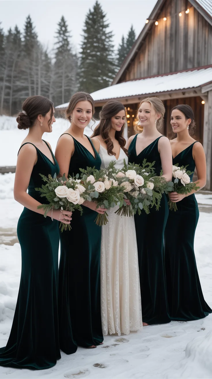
There’s something timelessly elegant about forest green paired with cream. This palette brings the outdoors in and works perfectly with wooden elements typical of rustic venues. I love how this combination feels both seasonal and sophisticated without being overtly “Christmas-y.”
- Primary colors: Forest green, cream, ivory, touches of gold
- Best for: Barn venues, lodges, venues with wooden architecture
- Complementary textures: Velvet, wool, wood, evergreen branches
One of my favorite weddings featuring this palette used cream-colored roses and ranunculus mixed with abundant evergreen foliage. The bridesmaids wore forest green velvet dresses that photographed beautifully against the snowy backdrop.
Pro Tip: Add depth to this palette by incorporating different textures – think velvet ribbons on bouquets, wool blankets as favors, and wooden chargers at place settings.
Palette 3: Burgundy and Gold
For couples seeking richness and warmth, burgundy and gold deliver in spades. This regal combination brings instant luxury to any rustic winter wedding and photographs beautifully. I’ve found this palette particularly stunning for late afternoon ceremonies when the golden hour light enhances these rich tones.
- Primary colors: Burgundy, wine, gold, cream
- Best for: Winery weddings, historic venues, evening celebrations
- Complementary textures: Velvet, brass, dark wood, berries
I’ll never forget the burgundy and gold wedding I coordinated where we used wine-colored dahlias, deep red roses, and gold-dipped feathers in the centerpieces. The bride’s burgundy velvet wrap was not only practical for the December weather but became a stunning accessory in photos.
Pro Tip: Use metallic gold sparingly as an accent rather than a dominant color. Think gold-rimmed glassware, candlesticks, or subtle touches on stationery rather than overwhelming gold tablecloths.
Palette 4: Plum and Grey
This sophisticated combination offers a modern twist on winter colors while maintaining that cozy rustic feel. The depth of plum paired with the neutrality of grey creates balance and elegance that works in virtually any venue.
- Primary colors: Plum, lavender, charcoal grey, silver
- Best for: Contemporary rustic venues, industrial spaces with rustic elements
- Complementary textures: Concrete, slate, silk, velvet
I recently worked with a couple who used this palette brilliantly – the groomsmen wore charcoal suits with plum ties, while centerpieces featured grey ceramic vessels filled with plum-colored anemones and silver brunia berries.
Pro Tip: Grey comes in many shades from light dove to deep charcoal. Choose a shade that complements your venue – lighter greys for brighter spaces, deeper greys for more intimate settings.
Palette 5: Navy and Silver
Navy and silver create a timeless, elegant palette that feels appropriate for winter without being overtly seasonal. This combination works beautifully for couples seeking a classic look with a touch of formality while maintaining rustic elements.
- Primary colors: Navy blue, silver, white, touches of light blue
- Best for: Evening weddings, converted barn venues, mountain lodges
- Complementary textures: Velvet, silver mercury glass, dark wood
One of my favorite navy and silver weddings featured tables with navy velvet runners, silver mercury glass vessels, and white flowers with silver dusty miller. The contrast was striking yet elegant, especially against the rustic wooden tables.
Pro Tip: Navy can appear almost black in evening lighting and photography. If you want the true navy color to show up, incorporate it in well-lit areas or consider a slightly lighter navy shade.
Palette 6: Dusty Rose and Sage
For couples seeking a softer approach to winter colors, dusty rose and sage offer romantic, muted tones that feel both current and timeless. This palette brings warmth and subtle color without overwhelming the rustic elements of your venue.
- Primary colors: Dusty rose, sage green, taupe, cream
- Best for: Daytime weddings, greenhouse venues, rustic-romantic settings
- Complementary textures: Linen, weathered wood, dried flowers
I made a rookie mistake at the first wedding where I used this palette – I didn’t account for how the dusty rose would photograph in certain lights. Now I always recommend testing your exact shade in the venue lighting before committing. When done right, like at a recent greenhouse wedding with sage foliage and dusty rose garden roses, the effect is breathtaking.
Pro Tip: Incorporate dried elements like pampas grass, dried roses, or preserved eucalyptus to enhance the muted quality of this palette while adding wonderful texture.
Palette 7: Chocolate and Ivory
There’s something incredibly cozy about chocolate brown paired with ivory. This combination feels warm, inviting, and perfectly suited to rustic winter celebrations. It’s also wonderfully versatile, working equally well for formal or casual affairs.
- Primary colors: Chocolate brown, ivory, cream, touches of gold
- Best for: Wooden barn venues, lodge weddings, intimate celebrations
- Complementary textures: Leather, fur, wood, burlap
One memorable wedding I coordinated used this palette with chocolate velvet ribbons on ivory bouquets, wooden chargers, and ivory candles in varying heights. The effect was sophisticated yet deeply comfortable – guests didn’t want to leave!
Pro Tip: Incorporate natural wooden elements that showcase their grain and texture rather than painting everything. The natural variation in wood tones complements this palette beautifully.
Palette 8: Black, White, and Gold
For the couple seeking drama and elegance within a rustic setting, black, white, and gold deliver powerful contrast and timeless appeal. This bold palette creates a striking look that feels both modern and classic simultaneously.
- Primary colors: Black, white, gold, ivory
- Best for: Evening ceremonies, New Year’s Eve weddings, dramatic spaces
- Complementary textures: Velvet, marble, brass, silk
I’ve found this palette particularly effective in venues with dramatic architectural features. At a recent wedding in a converted barn with soaring ceilings, we used black velvet linens, white flowers, and gold accents that highlighted the beautiful wooden beams above.
Pro Tip: When working with black in a rustic winter setting, balance it with plenty of warmth through lighting. Amber uplighting, hundreds of candles, or warm-toned string lights prevent the space from feeling cold or stark.
Palette 9: Red and Evergreen
This classic combination brings holiday cheer to your winter celebration without feeling like a Christmas party. The vibrant red against rich evergreen creates a festive atmosphere that feels seasonally appropriate and naturally rustic.
- Primary colors: Deep red, evergreen, gold, ivory
- Best for: December weddings, mountain venues, lodge celebrations
- Complementary textures: Pine, berries, flannel, wood
I once